What is a Landing page, how can they help your business and how can you build a successful one?
In marketing parlance a landing page is a standalone page on your website with a specific attorney marketing goal. A landing page can be a shopping cart, newsletter sign up form or marking inquiry. Usually a landing page will have external links pointing to it, a call to action and a thank you page behind it. They are windmills harnessing the gale force of visitor traffic and converting it to revenue for your business.
When it comes to designing high converting landing pages there’s a lot of science behind the eye catching graphic design, marketing practices, UI research, fancy JavaScript tricks and A/B split testing. But before we head down the rabbit hole let’s reflect on the basics. After all, every landing page out there lives or dies by a few essential ingredients.
The Goal
A goal is what differentiates a landing page from a regular old web page. Often times the goal will be for the visitor to sign up for something: a newsletter, a paid service or a membership of some sort.
The Message
 This is the first thing you’re visitors will see when they hit the Social Security disability landing page, for example. It should be a short sentence or two in a large typeface. I like to approach a landing page’s message by dividing it into three parts:
- Pose a problem: something your visitor might be looking for.
- Offer a solution: how can your business help this visitor find what he or she is looking for.
- The Value Proposition: an offer that immediately fulfills a visitor’s need in exchange for filling out your form.
The Description
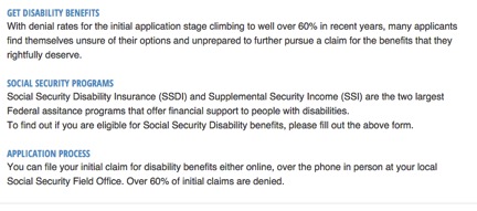
Your Social Security disability landing page, for example, should include a description of your products or service. Well written copy serves two purposes. First, your description informs your visitors about your business and what they will be signing up for. Additionally, a detailed description is a great SEO opportunity to seed your copy with keywords.
While writing copy it is important to pay attention to something called “message match”. Message match is simply the idea that the copy on your landing page should match the voice, style, and syntax of your ads, thank you page, etc.. This continuity creates a logical through line leading the visitor towards your goal.

The Form
Landing pages usually include a form for visitors to fill out. When designing the user input form, keep in mind that every field is an obstacle between the visitor and the goal. Brevity is critical.
Visitors are lazy; they prefer to click rather than to type. When possible, opt for select menus or checkboxes instead of text fields, as the following Social Security disability free case evaluation form shows. While there are a lot of options out there for customized form components, unfamiliar form elements may confuse and alienate some members of your audience.

The Call to Action
Your call to action is arguably the most important part of your landing page; it is how your visitor reaches the goal. On the web, a call to action should be placed within a clickable interactive element (in layman’s terms: a button). Calls to action should always have a hover and active state in order to communicate interactivity to the user.
Protip: Don’t use “Click Here”. Communicate click ability through design and context not heavy-handed instructions.
The Page Flow
Page flow is the idea that the information on your landing page should follow a precise and logical order. You don’t want the problem to follow the solution, or the submit button to be above the form.
Also keep in mind that long lines of text scare readers away. By breaking up your page into bullet points and steps, like breadcrumbs into the woods, you invite the visitor to follow along.

When creating landing pages for your campaigns keep these essential pieces in mind. Pay special care in crafting each piece of your landing page to cooperate with the larger vision and work in tandem toward the final goal.